As you may have seen, we made a quick survey that targeted our software users to help us get feedback and get a better understanding for any future plans. And now we’re gonna share some of the survey results with you.
In total we got 22 responses (really low response rate) where all of them are males, and most were between 29 and 40 years old entrepreneurs. There was a clear preference of white to be the color for a classifieds site.
As most respondents were relatively new users of Open Classifieds, we can see that factors affecting their choices when building a classifieds website were influenced by giving more value to their user experience than their own, which is a good indicator. But we can note here that the low number of responses to the survey doesn’t give a clear indicator that can be generalized.
Not many users used the open source characteristic of Open Classifieds, that could be related to concerns for accessibility to future updates in the software. And any changes on the theme don’t affect that accessibility, so we can see that many of the respondents made changes on their themes.
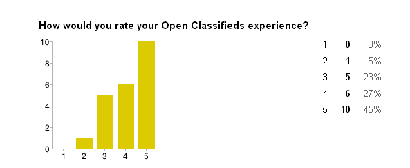
And finally, we’re very pleased to see the responses indicated in the chart below, where 5 means “Much better than expected”. However, we would appreciate it if we get more responses to the survey and get more feedback from you guys.
We’re keeping the survey open for new respondents in case you wanted to give your own answers and support Open Classifieds with some feedback, and it would take less than 2 minutes to finish
[jetpack_subscription_form]


